Introduction to MACD Histogram
The Moving Average Convergence Divergence (MACD) histogram is a popular tool among traders and analysts for identifying potential buy and sell signals in the stock market. It is a type of oscillator that helps to measure the momentum and direction of a trend. By understanding how to interpret the MACD histogram, traders can gain valuable insight into market dynamics and make more informed investment decisions.
Understanding the MACD Histogram
The MACD histogram is derived from two other components of the MACD, the MACD line and the signal line. The MACD line is the difference between two exponential moving averages (EMA), typically the 12-day and 26-day EMA. The signal line is a 9-day EMA of the MACD line. The MACD histogram is the difference between the MACD line and the signal line.
Interpreting the MACD Histogram
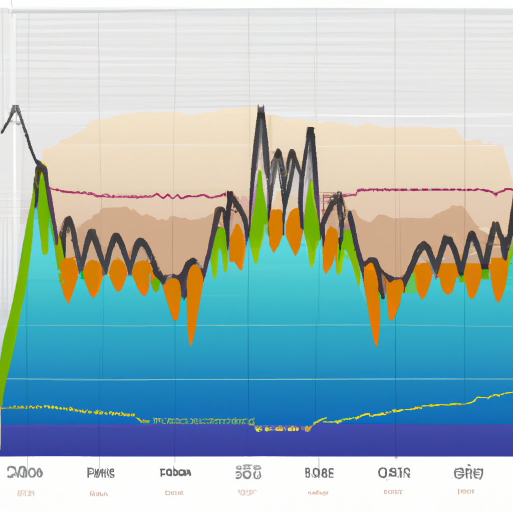
The MACD histogram oscillates above and below a zero line, also known as the centerline. Positive values indicate bullish momentum, while negative values indicate bearish momentum.
MACD Histogram Interpretations
1. Bullish and Bearish Crossovers
One of the primary interpretations of the MACD histogram involves crossovers of the MACD line and the signal line. When the MACD line crosses above the signal line, it generates a bullish signal, suggesting it might be a good time to buy. Conversely, when the MACD line crosses below the signal line, it generates a bearish signal, suggesting it might be a good time to sell.
2. Centerline Crossovers
Centerline crossovers are another important MACD histogram interpretation. When the histogram moves from below the zero line to above, it indicates a bullish market. Conversely, when the histogram moves from above the zero line to below, it suggests a bearish market.
3. Divergences
Divergences occur when the price of an asset and the MACD histogram move in opposite directions. This is often a sign of a potential trend reversal. A bullish divergence occurs when the price reaches new lows while the MACD histogram fails to reach new lows. A bearish divergence occurs when the price reaches new highs while the MACD histogram fails to reach new highs.
Limitations of the MACD Histogram
While the MACD histogram can provide valuable insights, it’s important to remember that no single tool should be used in isolation. The MACD histogram is a lagging indicator, meaning it follows price movements and often confirms them rather than predicts them. Therefore, it’s best used in conjunction with other forms of analysis.
Conclusion
The MACD histogram is a powerful tool for technical analysis, offering a visual representation of the difference between the MACD line and the signal line. By understanding how to interpret its signals, traders can gain a better understanding of market momentum and trend direction. However, as with all trading tools, it’s important to use the MACD histogram in conjunction with other indicators and forms of analysis to make the most informed trading decisions.


